
Double Dee & Steinski
I am very happy to have been able to collaborate with the hip-hop legends Double Dee & Steinski on the animated music video for their long-anticipated song “Lesson 4.” Originally begun in the 1980s, the song was never finished and was thought to be lost for many years. When a rough mix was found, the duo then set to work to recreate and finish the song in 2019.
The video combines many different types of media… 2D hand-drawn elements, photo cut-outs that I rigged and animated, and 3D models and characters. I composited everything and then processed the image sequence with various artificial neural networks.
For my second collaboration with Double Dee & Steinski, “The Craps Game,” I went with a 2D photomontage style arranged in 3D space in an homage to the game designer Yu Suzuki and his series of classic Sega superscaler ‘taikan’ (or ‘body sensation’) games of the 1980s.
No Place Like Home
I created this illustration for Perry Henzell’s film No Place Like Home, the follow-up to his breakout hit The Harder They Come. Due to a variety of unfortunate circumstances, this film went unfinished for over 30 years before finally debuting at film festivals in 2006. In the intervening years, its wider release has continued to be delayed due to music licensing issues. In 2015, as its wide release finally approaches, I wanted to create a hand-drawn poster image that would be complementary to the beautiful illustration for The Harder They Come, while still maintaining a strong identity of its own, representing the very different story and feeling of No Place Like Home.
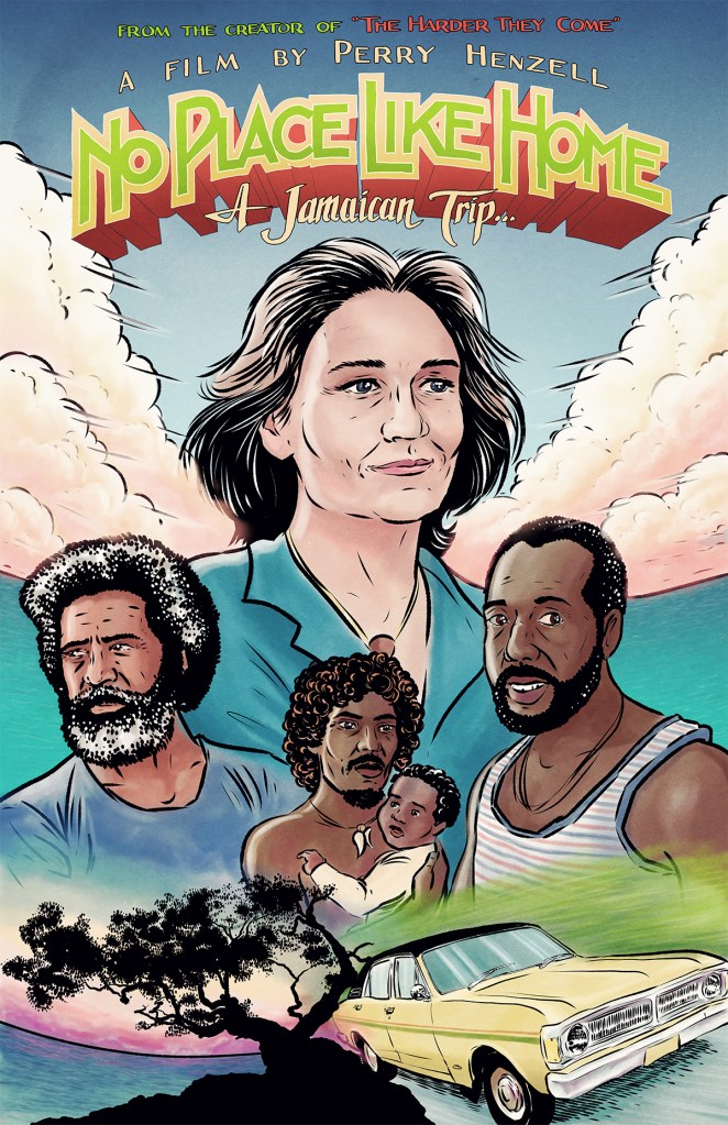
(This is the illustration for The Harder They Come, illustrator unknown.)

Microscope Dragons
Cover illustration for CD. This science fiction concept album follows the adventures of a group of dragon scientists who disguise themselves as humans in order to run experiments and influence the course of world events in conflict with their nemeses, the “Men in Grey Suits.” The illustration is rendered in a cel shading style, inspired by traditional hand-drawn animation. The logo design incorporates an “Rx” figure representing their involvement in pharmaceutical research.

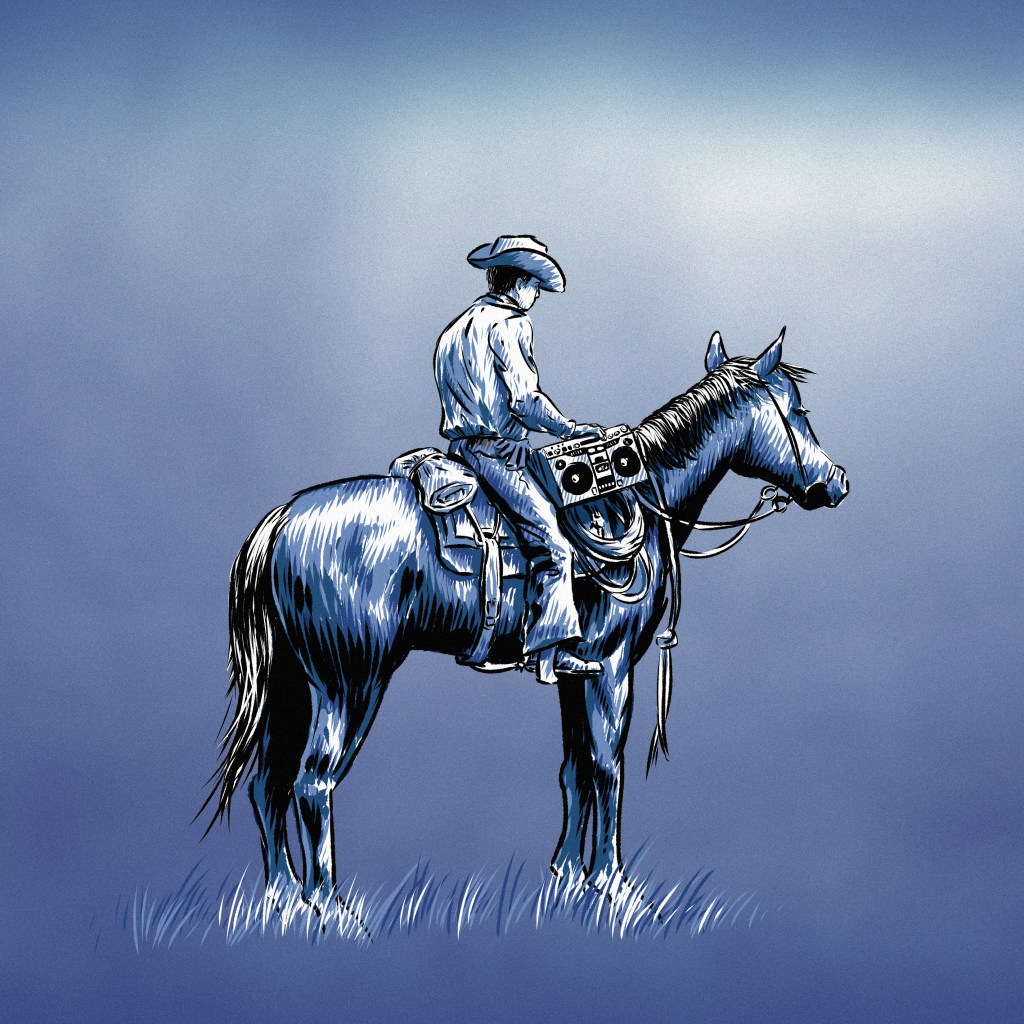
American Road Trip
This illustration is for a small collection of cowboy poetry recitations set to mellow acoustic hip-hop beats. The drawing is shaded monochromatically so that each mp3 track can have a different color scheme applied to its artwork. The shading is reminiscent of linoleum cut prints.
Zoonbats
Having established a hatching style for a series of underground comics, I wanted to explore how I could include some CG imagery for background elements. I developed a method of shading in discrete greyscale tones that could then be replaced with my own hand-drawn pen-and-ink crosshatching patterns.
CG elements can either be cel shaded in discrete tones, as in this example of one character’s homemade giraffe robot…

…or a virtual set can be constructed using full-color shaded 3D models. The rendered image can then be desaturated and posterized in photo editing software to the required number of discrete shading tones to be replaced by the hand-drawn crosshatch patterns. That’s how I approached this image for the site’s welcome/splash page.

In the process of developing this technique, I’ve learned many of its advantages and limitations. Tiny details will be completely lost to the “resolution” of the crosshatching. Some assets that would normally be naturally shaded in dark colors will not be visible, and it will be necessary to shade them in white or other light colors so they pop in the resulting image (e.g., utility poles).
Like most CG, this approach has a heavy pre-production time investment, but for use in projects that have the same setting (in this case, multiple pages of a comic that occur in the same place), it ultimately speeds up the process, fits decently with my established style, and saves my hand, wrist and arm a lot of crosshatching fatigue.
For the wraparound covers of this series of minicomics, I created hand-drawn illustrations as seen in the gallery below:


Moustaches
This illustration is for a vertically-oriented CD insert. The image is inspired by John Kennedy Toole’s novel A Confederacy of Dunces, in which the protagonist finds a printed pin-up image of a model reading Boethius, his favorite philosopher. This image combines hand-drawn portraits of the pin-up model smoking a pipe, below, and above are the band members, whose faces are within the cloud of smoke. The smoke cloud is composed of hand-drawn shapes mapped to 3D elements that have been instanced and set to inherit the transformations of their parent. The result of this hierarchy is a fractal-esque structure that can be translated and rotated in interesting spirals and twists.

